




















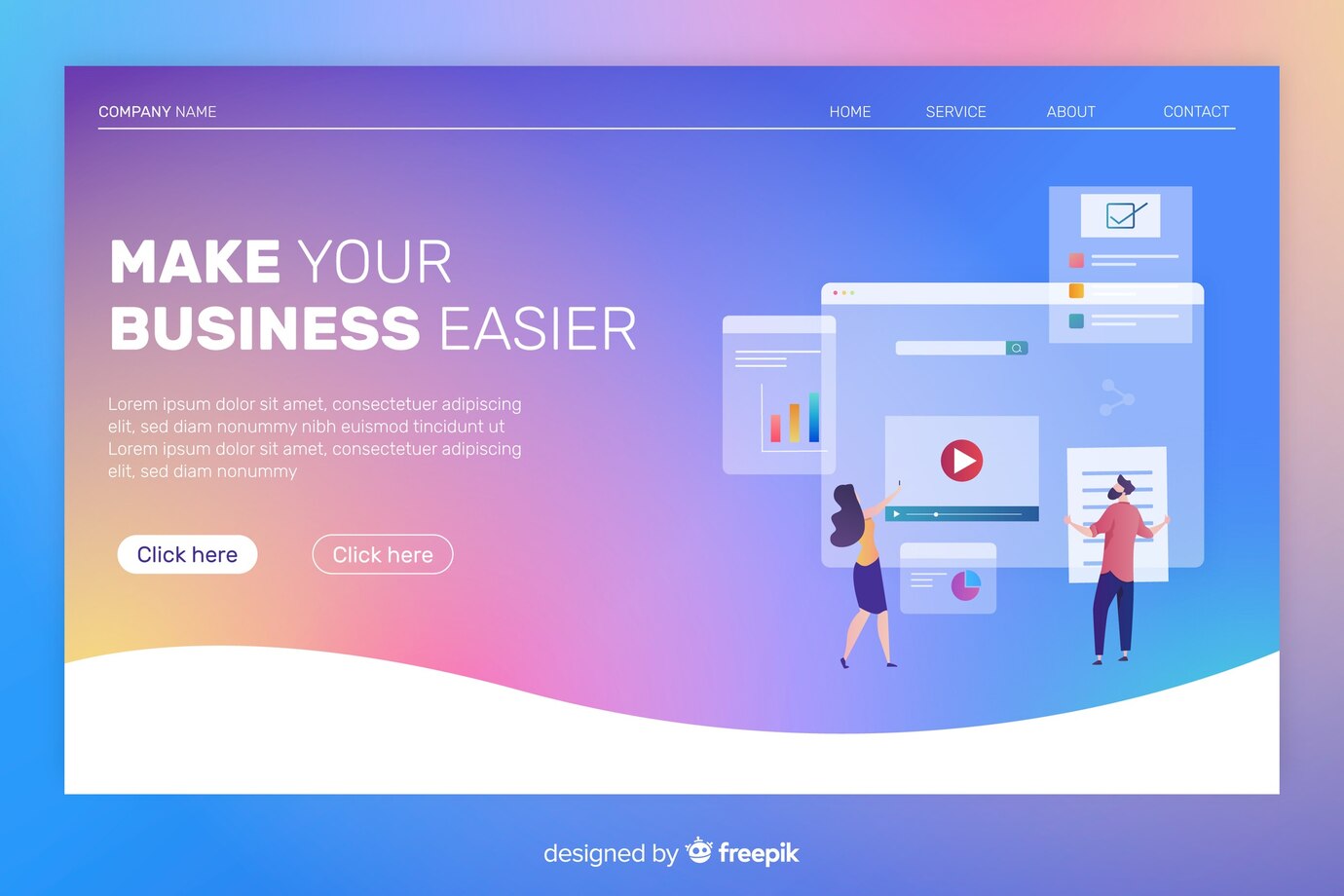
A landing page for an ad is a landing page that helps visitors understand an offer and take relevant action. The quality is determined by the suitability of the advertising message, clarity of information, ease of form, and follow-up after the visitor sends a request. Many visits alone do not prove that a page produces suitable potential customers.
Advertisements and landing pages have different roles. Advertising brings people with a certain promise; the landing page needs to explain and fulfill the context of the promise. If the ad offers warehouse systems consulting but the page only displays a general company profile, visitors will have to figure out the relationship between the two themselves. FourVM views landing pages as part of a user journey that needs to be designed alongside offerings and business processes.
Determine one main offer and action
Choose an action that suits the reader's readiness. Visitors who are understanding the need may not be ready to ask for a contract, but are willing to explain the problem for consultation. On the other hand, people looking for a detailed catalog may need access to information before talking to a seller.
Key actions could be sending a quote request, signing up for a consultation, or downloading materials. Determine what visitors receive, the data required, and the steps afterward. Don't combine too many competing invitations, such as buying, subscribing, applying for work, and following multiple channels in the same opening section.
One major action does not mean eliminating all navigation. The decision to provide additional links follows need and context. Readers may still need a privacy policy, company information, or scope explanation before trusting the form provided.
Organize a page of reader questions
The opening section needs to explain who the offer is being made to, the problem it is helping with, and the next action. After that, explain the scope, process, evidence and offering limits. This order can be changed based on the needs of the reader, rather than being forced into a pattern that always increases conversions.
Use the evidence that is actually available. Display examples, process explanations, and licensed case studies can help potential buyers assess suitability. Don't add client logos, sales increase figures, or testimonials that have not been published. If there is no evidence yet, explain the process and simulation examples honestly.
Maintain alignment between ad title and page. If there are important fees, terms, or limitations, communicate them before visitors submit data. Clear pages may filter out some inappropriate requests; it does not automatically indicate a failed design.
Create forms that support the process
Determine data based on follow-up needs. For an initial consultation, name, contact, type of need, and a brief description can be a starting point. Requests for the number of branches or systems used can be added if this helps prepare the discussion. Avoid requesting all information before the team understands the reason for collecting it.
The W3C recommends simple forms, clear labels, and notifications when an error occurs or a successful delivery. Check that fields remain comprehensible without relying on hint text that disappears when the user starts typing. Errors need to be explained in a way that helps correct the filling.
Also test sending failed. What happens when the connection is lost, the email address is incorrect, or the server doesn't accept the request? A button that changes color is not proof that data has been entered. The success message must match the process results, and the data needs to be received by the party who will follow up.
Differentiate between visits, actions and valid leads
Visits shows the pages accessed. A button click indicates intent to take the next step. The sent form shows the sending process occurred. Valid leads require assessing whether the request is real, contactable, and relevant to the offer. These metrics should not be interchangeable.
GA4 documentation provides a recommended generate_lead event for form submissions or information requests. Implementation requires setting and context; events should not be assumed to be available just because a page uses Analytics. The correct event name is not enough if the trigger is wrong.
Prepare notes with marketing and sales teams: entry date, campaign origin if known, need, contact status, and reasons for non-conformity. Don't enter sensitive data into Analytics parameters. Use data management processes that meet organizational policies and measurement needs.
Simulation case study 1: button clicks are considered leads
Fictitious installation service providers run advertisements on consultation pages. The report shows a lot of button clicks, so the owner assumes all the clicks are potential customers. Once explored, the button simply opens the conversation app; some visitors don't send messages.
The team separates communication click events from the conversation logs that are actually received. They still use clicks to understand page interactions, but assess leads through incoming, actionable messages. No number of new conversions can be concluded until testing and recording is done.
The lesson: technical metrics must have an operational definition. Frequently pressed buttons can be useful as signals, but are not proof of sales or valid leads.
Simulation case study 2: form too long
The fictitious training company asks for an ID number, complete address, organization size, and many attachments for an initial program consultation. The team actually only needs the contact person in charge, training theme, estimated participants, and discussion time. Additional data becomes relevant only after the need is confirmed.
The form is then adapted to the consultation stage. The team provides a brief explanation of the delivery goal and next steps. Testing is carried out via cellphone and keyboard, including when one column is required to be empty and when sending is successful.
The simulation results that can be stated are a flow that is more appropriate to needs and can be tested, not a certain percentage increase in conversion. The lesson: reducing fields must be accompanied by clarity of process, not just chasing the shortest form.
Check the results before making major design changes
If visits are high but demand is low, check the suitability of traffic sources and advertising promises first. After that, review whether visitors got the necessary information, whether the form worked, and whether incoming contacts were handled. Changing the button color does not resolve offers that do not meet requirements.
If many requests are irrelevant, clarify the type of customer, scope of service, region or stage of consultation. If relevant requests don't turn into conversations, evaluate follow-up and team availability. The landing page is one part of the system, so its evaluation requires context beyond the display.
Launch and evaluation checklist
Make sure the ad message and page are aligned; evidence can be traced; the form requests the necessary data; the display can be used on different devices; successful and failed processes have been tested; and the person responsible for follow-up is clear. Document the definition of each event before reading the report.
Should this page be in organic search? The decisions follow strategy and content. When targeted for search, the title, content, and page access still need to follow basic Google Search practices. Not all advertising pages have to target the same keywords as educational articles or service pages.
To prepare for developer work, read guide to creating a company website . FourVM can help discuss page development and integration according to actual needs. Get in touch FourVM with examples of offers, action objectives, and follow-up processes that you want to carry out.
Source
- W3C WAI — Forms Tutorial
- Google Analytics Help — Recommended events
- Google Search Central — SEO Starter Guide
- FourVM — service information . Source accessed14 November 2026.